 (Image via
The fear of color is real. It’s a condition that affects countless otherwise confident adults, reducing them to a state of panic in the paint aisle. They dream of vibrant, personality-filled homes, but when faced with a wall of paint chips, they retreat to the safety of greige. The result is a home that is perfectly pleasant, undeniably safe, but about as exciting as a tax form. Many of us associate bold color with commitment and risk, imagining a future where we’re stuck with a lime green accent wall that felt like a good idea for about five minutes.
But living a life devoid of color is no way to live. Color has a profound psychological impact; it can energize, calm, inspire, and bring joy. Infusing your home with color doesn't have to mean drenching every wall in a shocking hue or recreating a primary-colored playschool. The art of using color well is about balance and strategic placement. It’s about adding thoughtful, deliberate pops of personality that enliven your space without making it feel chaotic or overwhelming. With a few clever tricks, you can introduce color in a way that feels intentional, sophisticated, and, most importantly, uniquely you.
Start Small with Textiles and Accessories
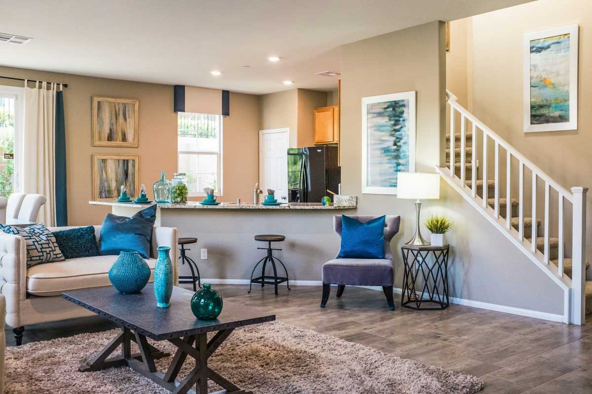
If you’re color-phobic, the easiest and least intimidating way to dip your toes into the chromatic pool is through textiles and accessories. Think of these items as the jewelry of your room, they are the finishing touches that add sparkle and personality without requiring a major commitment. A neutral sofa can be instantly transformed with a few jewel-toned velvet pillows. A plain white bedroom can come to life with a vibrantly patterned duvet cover. These are low-stakes, high-impact changes. If you get tired of a color, you can swap out a pillow cover for less than the cost of a fancy dinner.
This approach allows you to experiment and discover what colors you truly love to live with. Start with a single color and sprinkle it throughout the room in small doses. A throw blanket on the armchair, a vase on the bookshelf, and a piece of art on the wall that all share a shade of deep blue can create a cohesive and intentional look. This "color thread" guides the eye through the space and makes the color feel like a deliberate choice rather than a random accident. It’s a non-committal way to date color before you decide to marry it.
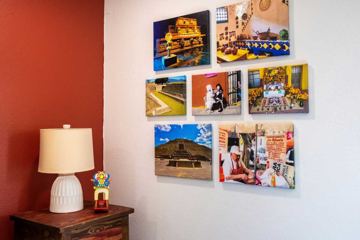
Use Art as a Color Palette Guide
Choosing a color palette out of thin air can be paralyzing. Instead of staring at a fan deck of a thousand paint colors, let a piece of art do the heavy lifting for you. A large, dynamic piece of artwork, whether it’s a painting, a photograph, or a textile hanging, can serve as the perfect color roadmap for an entire room. Find a piece that you absolutely love, hang it in a prominent spot, and then pull colors from it to use in your décor. This is a designer’s secret weapon for creating a sophisticated and harmonious space.
Once you have your art, identify two or three key colors within it. Use the dominant color for a few larger items, like an accent chair or a rug. Then, use the secondary, less prominent colors for smaller accessories like pillows, throws, and decorative objects. This ensures that all the colors in your room have a reason to be there; they are all connected to the central piece of art. It takes the guesswork out of color coordination and results in a room that feels curated and thoughtfully designed, not like a random assortment of colorful things.
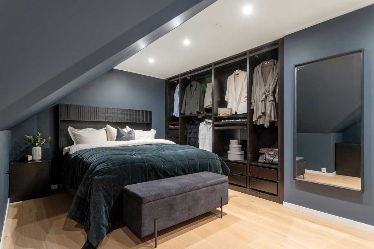
Paint a Strategic Accent or "The Fifth Wall"
The accent wall has gotten a bit of a bad rap over the years, often associated with a random, jarring wall of burgundy in an otherwise beige room. But when done thoughtfully, a painted accent can be a powerful tool. Instead of choosing a random wall, pick one with a purpose, the wall behind your bed to create a focal point, the wall your sofa is against, or a small nook that you want to highlight. This creates a deliberate feature rather than a color that feels out of place. And you don’t have to go neon; a deep navy, a rich forest green, or a warm terracotta can add depth and drama without being overwhelming.
An even more creative and unexpected approach is to paint "the fifth wall", the ceiling. Painting the ceiling a surprising color can add incredible character to a room. A soft, pale blue can evoke the feeling of the sky, making a room feel airy and open. A dark, moody color on the ceiling of a dining room or bedroom can create a cozy, intimate, and dramatic atmosphere. It’s a bold move that draws the eye upward and makes a space feel custom and unique. It’s an unexpected touch that shows you’re not afraid to have a little fun with your design.
Let Your Furniture Do the Talking
For a truly confident splash of color, let a piece of furniture be the star of the show. While a neutral sofa is a safe and versatile choice, a sofa in a rich emerald green, a sapphire blue, or a warm cognac leather can be an absolutely showstopping centerpiece. It acts as an anchor for the entire room and makes an immediate, powerful statement. If a colorful sofa feels like too much of a leap, you can achieve a similar effect on a smaller scale with a pair of vibrant armchairs, a painted credenza, or a colorful set of dining chairs.
This approach works best when the rest of the room provides a quiet backdrop. If you have a bold, colorful piece of furniture, keep the walls neutral and the other large elements subdued. This allows the colorful piece to truly shine without competing with its surroundings.
- The Statement Sofa: A colorful couch becomes the undeniable focal point. Build the rest of the room around it with neutral tones and small, complementary accents.
- Colorful Cabinets: Painting your kitchen island, a bookshelf, or a bathroom vanity is a fantastic way to add a block of color that feels integrated and custom.
- Accent Chairs: A pair of armchairs in a sunny yellow or a deep magenta can bring life to a neutral living room without the commitment of a full-sized sofa.
- A Painted Heirloom: Give an old, tired piece of furniture a new life with a coat of paint. A vintage dresser painted in a high-gloss lacquer becomes a modern statement piece.
- Dining Chairs: Keep the dining table classic and simple, but surround it with chairs in a fun color or even a mix of different colors for an eclectic, playful look.
Ground Brights with Natural Textures
One of the keys to making color feel sophisticated rather than chaotic is to balance it with plenty of natural textures. Bright, saturated colors can sometimes feel flat or synthetic on their own. By pairing them with organic materials, you ground them and add warmth and depth to the space. Think of it as a conversation between the vibrant, man-made color and the calming, natural world. The interplay between the two creates a room that feels balanced, rich, and inviting.
So, you’ve chosen a bold blue for your pillows and throw. Now, place those pillows on a tan leather sofa. Put a large woven basket for blankets next to it. Lay a natural jute rug underneath. Add a light wood coffee table and a few green plants. Suddenly, that bold blue doesn't feel so shocking. It feels purposeful and perfectly at home among the warm, earthy textures. Wood, leather, wool, linen, rattan, and stone are all fantastic materials for providing this crucial balance. They provide a resting place for the eye and prevent bright colors from overwhelming the senses, creating a space that is both colorful and serene.